Saturday 30 October 2010

Double page spread analysis

The layout of the contents page, is organised into columns and rows. As the image of Lily Allen is placed in the third column with the title 'People think I'm an attention seeker, But I'm just honest' in the first and second column. The head of Lily Allen is also placed in the top row so that the reader looks at the title 'People think I'm an attention seeker' and see Lily Allen's face. This shows that maybe Lily Allen is trying to show that she may look in her face that she is an attention seeker but underneath 'She is just honest'. The purpose of the article is to inform and review as the writer is informing the reader that Lily Allen is not as she seems but also review as it in a way is advertising her music and attracting more fans. 


The double page spread conforms to the house style of the magazine by following the same style font. The title of the article is 'People think I'm an attention seeker, But I'm just honest' the effect this has on the audience is that Lily Allen is not who she comes across as ( for example, 'An attention seeker') which gives the audience the effect that maybe Lily Allen is more likable than they thought. The conventions which are used are a quotations from the artist such as the title and the style of the font used which is a mixture of capital letters and lower case letters. This again could show the reader that Lily Allen is not whom she comes across as and may actually be a shy person hence the small letters in the title. The picture in this double page spread article is bigger and more pronounced than the writing other than the main title. This has the effect that Lily Allen is making a statement about herself and that a picture of her more important than the rest of the article? The image which has been used is of Lily Allen, her pose is very 'So what?' as her hands are on her hips and her facial expression looks very confident. Her clothes are quite casual and look high street bought which suggests that Lily Allen is your average girl who rised to fame by pure talent. The use of her wearing a tartan shirt shows that maybe she is a modern artist and therefore suggests that her music is modern too. 


The linguistic features which have been used are irony in the title as Lily Allen claims she is not an attention seeker in the title but then there is a main image of Lily Allen in a very attention seeking pose which almost suggests she is a bossy person. The effect this has on the reader is that they may have mixed perceptions on who the singer Lily Allen is or they may think that Lily Allen is all show but actually inside she is a decent person who wants to sell music. This links to the music magazine as goes with the target audience of young people who are into the fun side of music. The tone of the magazine is quite mocking in a way but then friendly as it promoting Lily Allen as an artist. The magazine article uses colloquial language to have a friendly outlook for readers so they are more likely to buy the music magazine again.

Monday 18 October 2010

Contents page!

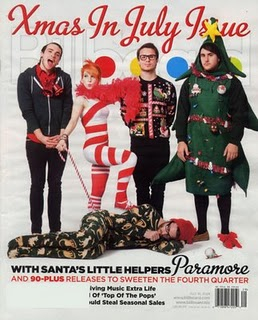
The layout of this contents page is organised into one column down the left hand side wth rows of whats in each page going down. The ratio of texts to pictures are there is more text than images though the images are more apparent as they are larger. This links with the genre of the Billboard magazine as the imagery is the main focus in the magazine. The contents page is consistent with the front cover as the xmas in july theme is continued with another picture of one of the band members. The style of font is also carried on in the title like it is on the front cover saying 'Billboard'. The overall style of the magazine is popular music and up and coming artists so the style is very plain with just one or two colors used. This is done so that the main cover images can be the main attraction. The features of the magazine which held sell it are the exclusive front cover about an early xmas and the popular rock band Paramore.
 Also, the features which make it appear exclusive are the xmas special and the professional formatting so the reader feels as if they are reading a magazine which knows what they are talking about. There are four images on the contents page, the images mise-en-scene have the same backgrounds a music theatre background or of a musicial instrument included within the image. The lingustic devices which are used to persuade the reader to buy the magazine are the use of bold text and different font for the subheadings so that they stand out. There is humour used throughout the contents page which has the effect on the target audience that Billboard magazine is a friendly music magazine which has modern humour for modern music tastes. The features of the magazine are easy to locate from using the contents page as a guide as the main feature e.g the xmas in the July issue is as the main feature so they have the main picture to guide you to the main contents page.

Mix magazine front cover!

The genre of this music magazine is dance/pop.The target audience for the music magazine 'mixmag' are people who are interested in dance and club music. Also, the target audience are festival loving people and mainly young people. I can tell this because the strap lines on the magazine cover are mostly to do with festivals and music events. The bright colours and cover image also suggests that mainly young people would opt to buying this magazine. The main image is of the singer 'little boots' which reflects the music genre of dance and club music as her songs are mostly funky dance tunes and most her music is probably played in clubs. The cover image is framed by straplines and pugs which advertize the latest music events and clubs. The actual camera shot of the cover image is a zoomed in shot which cuts out little boots's the lower legs. I think this shot has been used to make the main focus little boots and what she is wearing. The mise-en-scene of the cover image, clothes wise little boots is wearing a very festival/clubbing outfit which fits with the overall genre of the magazine. Also, the bright colours she is wearing and the different animal prints could show she likes being outside which links with festivals again. The make-up used on the cover image is very bronzy and peachy look which gives the effect that little boots has been on holiday and suntanned. This again fits with genre of festival music and being outside. The setting of the cover image is on grass which gives the effect that little boots is at her festival. The cultural codes which the mise-en-scene are very firery, festival loving and this is shown through little boots as her posture is quite casual but also looks like she is in a dance position. The main colours which have been used are reds, oranges and whites. They contribute to the mood of the image as they compliment the colours used in little boots make-up and the overall firery mood of the cover. The image relates to the target audience as little boots is young and a festival lover herself and her main genre of music is dance.
The magazine is called Mixmag this refects the content of the magazine as it suggests the magazine is going to be about club and dance music. This also effects the target audience as the reader aspects to find pages and interviews related to dance and club music. The type face which has been used is bold so it stands out on the page. The titles of the strap lines on the side of the page stand out as they are a different colours and bolder than the rest of the text. This copy has been placed in borders, in the specialised music magazine section. This is important because if the target audience wanted to find out about the latest music events or festivals then they would be drawn to this magazine.

Wednesday 13 October 2010

Blender music magazine cover!

The music magazine Blender is a pop music magazine based on chart music and popular artists. The target audience are young people and people into upcoming pop music in the charts. I can tell this by looking at the side pugs on the cover which are all about famous well known pop artists which is what the target audience of young people would be into. Also, the language is very simple which young people as a target audience would be attracted to and be able to relate to. The main cover image is of Katy Perry a well-known pop artist who has had several songs in the top charts. The image of Katy relates to music genre of pop music as Katy Perry is a famous pop singer and fits in with the pop genre of the magazine. 


The main image is framed by several strap lines either side of the image and the main title is placed behind Katy Perry's head which shows that Blender is a well known magazine as the whole name doesn't need to be shown. The framing of the image is rather spacey as there are several gaps left which makes the reader drawn in more to the cover image of Katy. The camera shot of the main cover image is mid shot as her legs are cut off half way, this has an effect to the viewer that maybe her legs are very long or are endless. The mise-en-scene of the image is very original as Katy Perry is wearing one of her famous 1950's bikini outfits which reflects her personal style to the reader and target audience as they know that her pop music is going to be unique. The makeup on the cover image is very natural and not too overdone as the main attention is meant to be on her clothes. Her hair is also done in 1950's curls which reflects her clothes again and her unique approach to pop music. The overall effect of the mise-en-scene used makes the cover image of Katy Perry stand out and draw attention to the fact that she is upcoming and modern. The cultural codes which are brought to mind when looking at the cover image are one of a kind celebrities who make their own interpretations of their work. The main colors which have been used are pink, black and white which contribute to the mood of the image as the colors compliment the bow in Katy Perry's hair and they work well with creating the girly effect of the image. The cover image relates to the target audience as Katy Perry is young and a famous pop singer which relates to the target audience of young people and people into popular chart music. 

The magazine is called Blender this reflects the content of the magazine as the reader expects to find maybe a mixture of different chart songs not just pop music. The title Blender also reflects the target audience of the magazine as the reader expects to find modern music as the masthead blender suggests that the pop music inside will be appropriate for people with modern music tastes. The type face which has been used are slim capital letters which stand out on the page as not all of the font is the same size. The effect the type face has is that it attracts readers as its really eye catching and adds to the style of the magazine cover of being about technology and being modern. This copy has been placed in HMV in an average magazine size, it is important as HMV is a well known music store and sells all good music magazines. 

Monday 11 October 2010

Billboard music magazine front cover!

The target audience of the music magazine 'Billboard' is for young people or people who like popular chart music and famous music artists. I can tell this because most of the strap lines are about chart music and new upcoming ways to download music and video's. The main cover image is of the music artist 'Lily Allen', which relates to the music genre as she is a famous popular artist who has also won a brit award for her music. The main cover image is framed by strap lines on both sides of the image also the shot is a head and shoulder camera shot which makes Lily the centre of the magazine and catches your attention.

The mise-e-scene of the cover image are that Lily Allen is wearing a white tank top and a head scarf which are both fashionable items which also fits in with the magazine being popular and modern. The makeup used on Lily Allen is very natural and the hair also looks very casual but modern which again fits in with the magazine. The overall effect, of the mise-en scene makes the magazine look up to date and current with the times. The cultural cues which are brought to mind are of celebrities which have glossy outlooks and glossy lifestyles. The main colors which have been used n the cover are bright pink and white. These colors contribute to the mood of the image as the white writing matches the tank top Lily is wearing and the white headscarf. The cover image of Lily Allen relates to the target audience of young people and people who are interested in chart music as Lily Allen is young and popular and quite often in the chart. 


The music magazine is called 'Billboard', this title reflects the content of the magazine as the reader aspects to find popular music and artists in the magazine itself. The masthead of the magazine reflects the target audience also as the target audience of people into popular music aspect to find popular music inside. The type face which has been used are bold comic sans font which gives the effect of the magazine being playful and fun. They have also used bold font for certain language like 'Lily Allen' and the subtitles for the strap lines. This gives the effect of mini stories or tasters of what will be inside the magazine. This copy has been placed in an everyday news agents, this is important so that people interested in chart music music can just pick up the magazine instead of having to order it in.

NME music magazine cover!


The NME music magazine's target audience are young people and people who are into the latest music in the charts. I can tell this by looking at the strap lines which are all related to modern music such as 'The state of music today' shows that the magazine is going to appeal to readers who are into current music today. The main image is of Florence Welch from the the band 'Florence and the machine', the image relates to the music genre of popular, upcoming music as Florence recently won a Brit award for best album which shows she is popular and modern. The image is framed by just having two strap lines either side of the image of Florence by her hair. This has the effect that Florence has the text in her hair and also it draws the reader in to look at her face. The image is also framed as it is a close up head shot of her face which is very eye catching for the target audience of people into modern music.

The mise-en-scene of the cover image are that Florence Welch is dressed very plainly in a white top which matches the same white color of the magazine title. The makeup used on the cover image is quite natural but with smokey eyes which again follows modern fashion which fits with modern music. The overall effect of the mise-en-scene used on the front cover of NME makes the magazine look very professional and polished as all the colors match and the main colors are black and white accept for Florence's flame red hair which stands out and catches your attention. The cues which are brought to mind in terms of culture are glossy celebrities as Florence Welch looks very polished and sleek on the cover in terms of the way her hair is and her clothes. The colors which have been used on the front cover are black and white which fit in the colors of the the cover image, as Florence is wearing a white top and has black smokey makeup. However, Florence's hair is a bright flame red which contrasts with the rest of the color scheme and stands out on the page. The colors contribute to the mood of the cover image by creating a generally sleek look and very simple but effective look. The cover image of Florence Welch relates to the target audience of the NME magazine as she is a popular artist which fits in the theme of the magazine being about popular, upcoming music.

The magazine is called NME which stands for 'New music express' this reflects the content and target audience of the magazine as it is for popular and upcoming music and artists only which means that only readers who are into popular chart music are going to want to read the magazine. Also, the content is reflected by the title as obviously there is only going to be about chart music and popular music artists. The typeface used on the magazine is mostly in bold block capitals to stand out on the page and attract readers. The effect which it has is that it again stands out on the page but also is easier to read so the target audience are more likely to read the strap lines. This copy of NME has been placed in WHsmith in a average A4 size for a magazine, it is important as NME is one of the first music magazines to have the current chart in its content.

Wednesday 6 October 2010

My school magazine contents page!

This is my school magazine contents page, for the layout I decided to put my images on one side of the page and text on the other side. I decided to use images of the school canteen, a sixth former studying and a teacher marking some work. I also added page numbers in the corner of the images so they looked more professional and so the whole page looked more like a contents page also. For the title of the contents page I decided to keep it simple by having the font the same as on the front cover and just plain black as the font colour. For the main text on the contents page, I made the page numbers bigger than the rest of the text on each mini paragraph. If I was to create my contents page again I would make the layout more interesting by not having such  a simple layout and maybe using more images and colours to make it more exciting and eye catching.

My school magazine front cover!

 This is my Lordswood girls sixth form magazine front cover, for  the target audience of sixth formers to read the latest updates and events. For the colours I chose to stick to a colour scheme of green, red and black which makes the front cover look more professional and not untidy or all over the place. The colours are also bright and eye catching so sixth formers are more likely to want to read it. For the side images on the front cover, I decided to go with the idea of having the side images like mini photographs on a notice board. To show this, I rotated the images slightly like they had just been pinned up. Also, the image subjects on the cover are all sixth form related events such as new  school lockers, top ten revision tips etc. For my cover image, I decided to use three sixth form students with folders to show how dedicated sixth form students should be! The cover image in my opinion has worked well because the lively colours stand out on the page. If I was to do the cover image again I would stretch the image more,so then I would not have to have a background colour but I would use the cover image as the background.
        For the title, I kept it simple by using the same font as the straplines and using the colours black and green and highlighting the word 'sixth form' so people are aware who the target audience are. The strap lines on the front cover relate with the strap line images above such as 'top ten revision tips' with a picture of a boy studying above and 'new lockers in school now' with a picture of the new lockers. I also highlighted certain parts of the strap lines by having the  font in green to attract the reader.  The layout of my school magazine cover is rather casual which is what I wanted to convey to the target audience as well as looking slightly fun and exciting. I think my magazine cover looks quite cheap due to the bright colours and cartoony feel to it which is something I would improve if I was to do it again. For the kicker, I decided to use something that would really draw readers in such as having a 'behind the scenes' coverage of the school council, as sixth formers would want to find out what goes on in their meetings. Also on the cover, I added a skyline of 'specialist centre of media arts' to show how great Lordswood sixth form is and highlighting what we are good for as a school and sixthform. I also added an extra section at the bottom, of the school website so sixth formers could remember to go on to the school website for the latest news. On the cover, I also added a puff saying 'free poster inside' which again attracts readers as they might buy the magazine for the free poster or they might see it as an added bonus on the magazine itself.
          On the front cover, I also made sure I presented male and female sixth form students both as students and shown as hardworking whilst having fun at the same time as they are all smiling in the images. Overall, I think my magazine cover offers many exciting reads which are relevant for all sixth form students to find out new events which are coming up.