
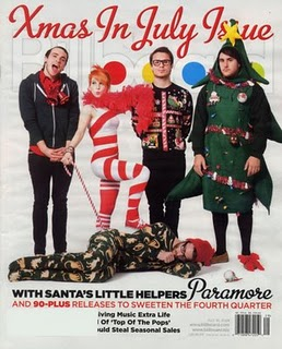
The layout of this contents page is organised into one column down the left hand side wth rows of whats in each page going down. The ratio of texts to pictures are there is more text than images though the images are more apparent as they are larger. This links with the genre of the Billboard magazine as the imagery is the main focus in the magazine. The contents page is consistent with the front cover as the xmas in july theme is continued with another picture of one of the band members. The style of font is also carried on in the title like it is on the front cover saying 'Billboard'. The overall style of the magazine is popular music and up and coming artists so the style is very plain with just one or two colors used. This is done so that the main cover images can be the main attraction. The features of the magazine which held sell it are the exclusive front cover about an early xmas and the popular rock band Paramore.
Also, the features which make it appear exclusive are the xmas special and the professional formatting so the reader feels as if they are reading a magazine which knows what they are talking about. There are four images on the contents page, the images mise-en-scene have the same backgrounds a music theatre background or of a musicial instrument included within the image. The lingustic devices which are used to persuade the reader to buy the magazine are the use of bold text and different font for the subheadings so that they stand out. There is humour used throughout the contents page which has the effect on the target audience that Billboard magazine is a friendly music magazine which has modern humour for modern music tastes. The features of the magazine are easy to locate from using the contents page as a guide as the main feature e.g the xmas in the July issue is as the main feature so they have the main picture to guide you to the main contents page.
Also, the features which make it appear exclusive are the xmas special and the professional formatting so the reader feels as if they are reading a magazine which knows what they are talking about. There are four images on the contents page, the images mise-en-scene have the same backgrounds a music theatre background or of a musicial instrument included within the image. The lingustic devices which are used to persuade the reader to buy the magazine are the use of bold text and different font for the subheadings so that they stand out. There is humour used throughout the contents page which has the effect on the target audience that Billboard magazine is a friendly music magazine which has modern humour for modern music tastes. The features of the magazine are easy to locate from using the contents page as a guide as the main feature e.g the xmas in the July issue is as the main feature so they have the main picture to guide you to the main contents page.
No comments:
Post a Comment